DIGITAL
BRANDING
Client: Velvet Bean – Artisan Coffee & Social Lounge
Scope: Logo Design · Brand Identity · Visual Direction
Project Overview:
Velvet Bean is a high-end coffee house designed for those who appreciate refined taste, immersive atmosphere, and thoughtful design. From handcrafted brews to a curated café experience, Velvet Bean caters to a discerning clientele seeking more than just coffee—it’s a lifestyle destination for professionals, creatives, and connoisseurs.
The objective of this branding project was to create a logo and visual identity that embodied elegance, warmth, and artisanal quality. The identity needed to speak to a mature, upscale audience while remaining accessible and authentic. Visual cohesion across packaging, signage, and digital presence was essential to position Velvet Bean as a premium yet welcoming brand.
Design Concept:
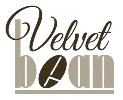
The final logo features a typographic pairing that evokes sophistication and structure. The wordmark is split into two complementary treatments:
“Velvet” is rendered in a flowing, calligraphic script, suggesting softness, richness, and the luxurious experience associated with velvet fabric.
“bean” is designed using a bold, geometric font with clean Art Deco-inspired forms, grounding the identity with architectural structure and visual weight.
A stylized coffee bean icon is embedded in the “e” of “bean,” tilted and segmented to reinforce both the literal product and the brand’s attention to handcrafted detail. The logo structure supports vertical and stacked formats, making it versatile for a range of applications.
Typography & Color Choices:
Typography:
The logo combines a refined script typeface with a custom geometric sans-serif, balancing elegance and strength. This contrast mirrors the brand’s dual emphasis on comfort and quality craftsmanship.
Color Palette:
Taupe Beige: Neutral, earthy tone that evokes calm and comfort
Espresso Brown: Deep, warm tone symbolizing richness and the product itself
Cream (optional accent): A soft tone for contrast and warmth
These tones were chosen to reflect both the interior aesthetic of a high-end café and the natural tones of coffee, beans, and raw materials.
Audience & Brand Positioning:
Velvet Bean is crafted for an audience that values experience as much as taste. The identity was designed to resonate with:
Professionals seeking a premium place to relax, work, or socialize
Design-conscious customers who notice visual details and atmosphere
Coffee enthusiasts who appreciate craftsmanship and consistency
Urban locals and travelers looking for a calm, elevated café experience
The brand identity aligns with boutique hospitality trends, independent roasteries, and lifestyle cafés that build loyalty through quality and design.
Tagline & Messaging Theme:
“Crafted Comfort. Every Cup, Every Time.”
While not embedded in the logo itself, this line complements the brand’s tone—inviting, refined, and intentional.
It emphasizes both product quality and the sensory experience Velvet Bean delivers to every guest.
Outcome:
The final brand identity is visually sophisticated, conceptually rich, and built for versatility. The interplay of elegant script and modern geometry speaks to Velvet Bean’s unique positioning: a place where every detail—from the typography to the espresso—is handled with care. With this identity, Velvet Bean is equipped to present itself confidently in competitive urban markets, stand out visually, and establish an emotional connection with its customers.